Let’s face it—scrolling through a poorly designed mobile site feels like trying to navigate a maze blindfolded. With nearly every online interaction happening on smartphones today, businesses that ignore mobile optimization aren’t just losing clicks—they’re burning bridges with potential customers. But how do you create a mobile experience that actually works? Let’s dive into the do’s, don’ts, and game-changing strategies to transform your site from frustrating to frictionless.
Why Mobile Design Can Make or Break Your Business
Think about the last time you abandoned a website. Was it because the text was too small to read? Or maybe the “Buy Now” button was impossible to tap without accidentally hitting an ad? These tiny annoyances add up. Studies show that 53% of users leave a site if it takes longer than three seconds to load, and cluttered layouts are a top reason for high bounce rates.
Mobile users aren’t just browsing—they’re often multitasking, in a rush, or using shaky public Wi-Fi. If your site doesn’t respect their time and screen space, they’ll vanish. Here’s how to avoid the most common pitfalls and keep them engaged.

Mistake #1: Hero Sections That Hog the Spotlight (In a Bad Way)
The hero section is your first impression. But stuffing it with high-res images, flashy animations, and a novel’s worth of text? That’s like handing someone a textbook when they asked for a tweet.
Solutions That Work
- Cut the clutter. Use a short, punchy headline (think 5–7 words) and a subheading that answers “What’s in it for me?”
- Replace giant images with symbols. A tiny rocket icon can scream “fast results” better than a pixelated stock photo.
- White space is your friend. Padding around buttons and text makes your site feel calm, not chaotic.
Real-World Example: Dropbox’s mobile site uses a clean blue background, a simple “Get Started” button, and zero distractions. No wonder their conversions skyrocketed after simplifying their design.
Mistake #2: Buttons That Play Hide-and-Seek
Nothing kills a sale faster than a button users can’t find—or worse, can’t tap without zooming in. Ever tried clicking a “Subscribe” link only to hit a tiny “Terms of Service” footnote? It’s infuriating.
Get It Right
- Size buttons for thumbs, not mice. Aim for 52–64 pixels tall (about the size of a fingertip).
- Stick to the “thumb zone.” Place key buttons in the bottom half of the screen for one-handed ease.
- Add visual feedback. A slight color change or vibration when tapped reassures users they’ve succeeded.
Pro Tip: Airbnb nails this. Their “Search” button is bright, bold, and impossible to miss, sitting comfortably at the bottom of the screen.
Mistake #3: Animations That Overstay Their Welcome
Sure, that spinning logo looks cool on desktop. But on mobile, it’s like forcing users to watch a buffering wheel while their coffee gets cold.
Keep It Simple
- Skip auto-play videos. They eat data and annoy users. If you need video, let them press play.
- Use motion sparingly. A subtle fade-in for text or a smooth scroll effect is enough to add polish.
- Test speed relentlessly. Tools like Google’s PageSpeed Insights highlight elements that slow your site.
Fun Fact: Amazon found that a 100-millisecond delay in load time could reduce sales by 1%. This highlights the importance of fast-loading pages in e-commerce. Meanwhile, Shopify stores that load within 3 seconds have a 79% higher conversion rate than those that take longer.

Mistake #4: Desktop Copy That Doesn’t Translate
Paragraphs that look crisp on a 27-inch monitor turn into unreadable walls of text on a 6-inch screen. And jargon like “leveraging synergistic solutions”? Yeah, nobody has time for that.
Mobile-Friendly Copy Tips
- Chunk it up. Use bullet points, numbered lists, and bold keywords to make content scannable.
- Speak like a human. Swap “Utilize” for “Use,” “Commence” for “Start.”
- CTAs with personality. Instead of “Submit,” try “Grab My Free Trial” or “Yes, I Want This!”
Case Study: Slack’s mobile site uses different copy and clear titles to explain features—no fluff, just value.
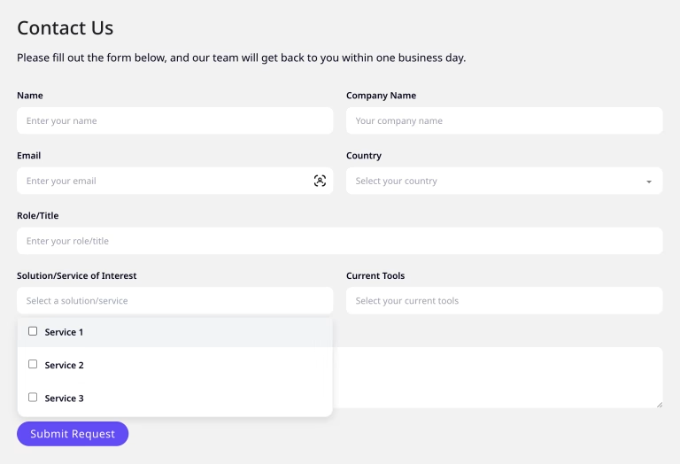
Mistake #5: Forms That Feel Like Interrogations
Asking for a user’s birthdate, shoe size, and LinkedIn profile before they’ve even seen your product? That’s a fast track to rage-quit territory.
Simplify the Process
- Only ask for essentials. Email and password are enough for signup. Save the details for later.
- Offer passwordless logins. Magic links sent via email or SMS cut friction dramatically.
- Enlarge form fields. Tiny boxes cause typos, and typos cause frustration.
Pro Move: Spotify lets you sign up with Apple or Google in one tap—no typing required.
Next-Level Hacks for Mobile Mastery
- Ditch Sticky Headers (Mostly)
A fixed menu bar might seem handy, but it steals screen space. Try hiding it on scroll or using a floating hamburger menu. - Test in the Wild
Don’t just rely on simulators. Check your site outdoors in sunlight, on older phones, or with slow 3G. You’ll spot issues labs never reveal. - Micro Visuals Over Megapixels
A small gradient or geometric shape adds flair without slowing your site. Bonus: They load faster than images. - Heatmaps Are Gold
Tools like Hotjar show where users tap, scroll, and rage-click. Use this data to tweak layouts and CTAs.
The Secret Sauce? Iterate, Iterate, Iterate
Even the best designs need tweaking. Run A/B tests on button colors, headline variations, or layout changes. For example, changing a CTA from “Learn More” to “Get Started Free” boosted conversions for HubSpot by 30%.
Quick Checklist for Mobile Audits
- Are buttons thumb-friendly?
- Does text resize without zooming?
- Do images load in under 3 seconds?
- Can users complete key actions (signup, purchase) in 3 taps or fewer?
Wrapping Up: Mobile Isn’t the Future – It’s Now!
The average person spends 4+ hours daily on their phone. If your site isn’t tailored for that reality, you’re invisible to a massive chunk of your audience. Start by trimming the fat—kill unnecessary animations, simplify copy, and design for fingers, not cursors.
But don’t stop there. Watch real people use your site. Note where they hesitate, sigh, or exit. Then tweak, test, and repeat. Because in the end, a great mobile experience isn’t about fancy features—it’s about respecting your users’ time, space, and sanity.
Ready to transform your mobile site from “meh” to “must-bookmark”? Pick one tip from this list and implement it today. Your users (and your conversion rate) will thank you.