
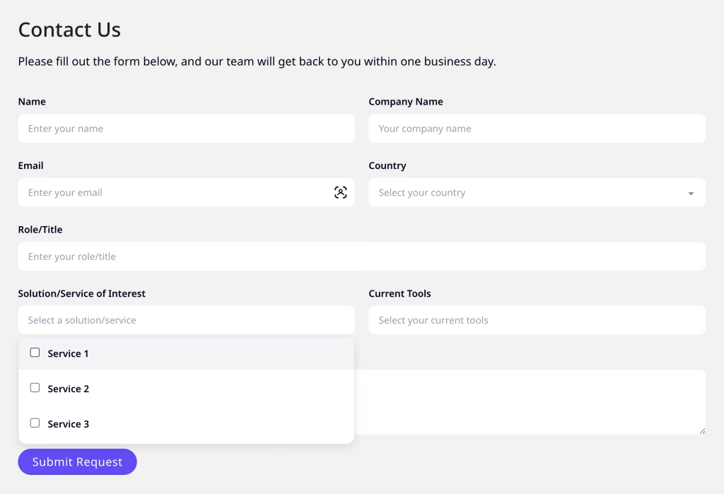
Bricks Builder doesn’t offer a native multi-select option for form dropdowns. If you need users to select multiple options from a dropdown, without installing a plugin, you can convert any standard select field using Javascript
Step 1: Add Name Attributes to Your Select Fields
First, add a name attribute to each select field you want to convert. In Bricks, you can do this via the field settings or by adding a custom attribute.
For example:
name="interests"for your first dropdownname="tools"for your second dropdown
This gives us a reliable way to target specific fields.
Step 2: Add the Javascript
Add this code to your page using a Bricks Code element or in the custom code section of the page.
<script>
window.addEventListener('load', function() {
    setTimeout(function() {
        var targetNames = ['interests', 'tools']; // Only these fields will be converted

        targetNames.forEach(function(name) {
            var select = document.querySelector('select[name="' + name + '"]');
            if (!select || select.dataset.converted) return;

            select.dataset.converted = 'true';

            var hiddenInput = document.createElement('input');
            hiddenInput.type = 'hidden';
            hiddenInput.name = name;

            select.name = name + '_original';

            var wrapper = document.createElement('div');
            wrapper.className = 'custom-multiselect';
            wrapper.style.cssText = 'position:relative;';

            var btn = document.createElement('div');
            btn.className = 'multiselect-btn';
            btn.setAttribute('tabindex', '0');
            btn.setAttribute('role', 'combobox');
            btn.setAttribute('aria-haspopup', 'listbox');
            btn.setAttribute('aria-expanded', 'false');
            var placeholder = select.querySelector('option.placeholder');
            btn.textContent = placeholder ? placeholder.textContent : 'Select...';
            btn.dataset.placeholder = btn.textContent;

            var dropdown = document.createElement('div');
            dropdown.className = 'multiselect-dropdown';
            dropdown.style.display = 'none';
            dropdown.setAttribute('role', 'listbox');

            Array.from(select.options).forEach(function(opt) {
                if (opt.classList.contains('placeholder') || !opt.value) return;

                var label = document.createElement('label');
                label.className = 'multiselect-option';

                var checkbox = document.createElement('input');
                checkbox.type = 'checkbox';
                checkbox.value = opt.value;
                checkbox.dataset.text = opt.textContent;

                label.appendChild(checkbox);
                label.appendChild(document.createTextNode(' ' + opt.textContent));
                dropdown.appendChild(label);
            });

            btn.addEventListener('click', function(e) {
                e.stopPropagation();
                document.querySelectorAll('.multiselect-dropdown').forEach(function(dd) {
                    if (dd !== dropdown) {
                        dd.style.display = 'none';
                        dd.previousElementSibling.setAttribute('aria-expanded', 'false');
                    }
                });
                var isOpen = dropdown.style.display === 'none';
                dropdown.style.display = isOpen ? 'block' : 'none';
                btn.setAttribute('aria-expanded', isOpen ? 'true' : 'false');
            });

            btn.addEventListener('keydown', function(e) {
                if (e.key === 'Enter' || e.key === ' ') {
                    e.preventDefault();
                    btn.click();
                } else if (e.key === 'Escape') {
                    dropdown.style.display = 'none';
                    btn.setAttribute('aria-expanded', 'false');
                }
            });

            dropdown.addEventListener('change', function(e) {
                var checked = dropdown.querySelectorAll('input:checked');

                if (checked.length === 0) {
                    btn.textContent = btn.dataset.placeholder;
                    hiddenInput.value = '';
                } else {
                    var texts = [];
                    var values = [];
                    checked.forEach(function(cb) {
                        texts.push(cb.dataset.text);
                        values.push(cb.value);
                    });

                    if (checked.length > 2) {
                        btn.textContent = checked.length + ' items selected';
                    } else {
                        btn.textContent = texts.join(', ');
                    }

                    hiddenInput.value = values.join(', ');
                }
            });

            select.style.display = 'none';
            select.parentNode.insertBefore(wrapper, select);
            wrapper.appendChild(btn);
            wrapper.appendChild(dropdown);
            wrapper.appendChild(hiddenInput);
            wrapper.appendChild(select);
        });

        document.addEventListener('click', function(e) {
            if (!e.target.closest('.custom-multiselect')) {
                document.querySelectorAll('.multiselect-dropdown').forEach(function(dd) {
                    dd.style.display = 'none';
                    dd.previousElementSibling.setAttribute('aria-expanded', 'false');
                });
            }
        });
    }, 500);
});
</script>Code language: JavaScript (javascript)
The script targets select fields by their name attribute, hides the original dropdown, and replaces it with a checkbox-based UI. A hidden input stores all selected values as a comma-separated string so the form submits correctly.
Step 3: Add the CSS code
Add this CSS to style the multi-select dropdown. Change this as needed.
.multiselect-btn {
    background: #fff;
    border: 1px solid #e2e8f0;
    border-radius: 9999px;
    padding: 12px 20px;
    cursor: pointer;
    font-size: 16px;
    color: #6b7280;
    white-space: nowrap;
    overflow: hidden;
    text-overflow: ellipsis;
    max-width: 100%;
}

.multiselect-dropdown {
    position: absolute;
    top: 100%;
    left: 0;
    right: 0;
    background: #fff;
    border: 1px solid #e2e8f0;
    border-radius: 12px;
    margin-top: 4px;
    z-index: 100;
    box-shadow: 0 4px 12px rgba(0,0,0,0.1);
}

.multiselect-option {
    display: block;
    padding: 10px 16px;
    cursor: pointer;
}

.multiselect-option:hover {
    background: #f3f4f6;
}

.multiselect-option input {
    margin-right: 8px;
}Code language: CSS (css)